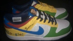
Sure, I get that it's a complete gag gift of a shoe but still! They use the old hilarious Google logo complete with the exclamation point. And is that Google Maps underneath the Swoosh? Just what the hell is going on here.
The sneakers were designed by Evan Steinberg, Google Community Manager for Android and signed by Larry Page. Are we sure it wasn't Steinberg's niece or nephew who made these?
9 comments:
I couldn't agree more ! Great blog, I'd like us to follow each other, are you interested ? Kisses
Fashion and Cookies
My Twitter
Wow. I have to admit you're completely right with this. These are utterly horrible. As you say, even the most geeky gamer probably wouldn't fancy being caught in these things!
I hope Google is joking.
Those are some seriously ugly shoes!
yea couldn't agree more. UGLY
To be fair, the guy didn't major in fashion design so he knows shit about what he's doing.
Ugh. Although any time I see dunks they usually have the color scheme of a box of Nerds anyway. An ugly shoe overall in my opinion.
Those are truly hideous. I think a nice basic black would be far better.
He really should have just used the Google colors and call it day. It truly does look terrible.
Post a Comment